...
| Term | Description | Example Graph |
|---|---|---|
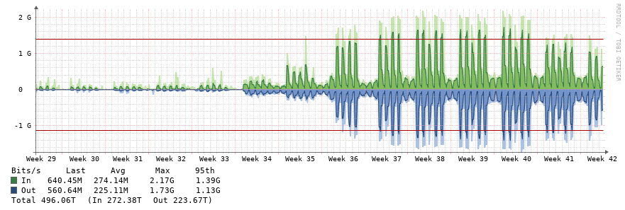
| bps | Bits per second
|
|
| pps | Packets per Second | 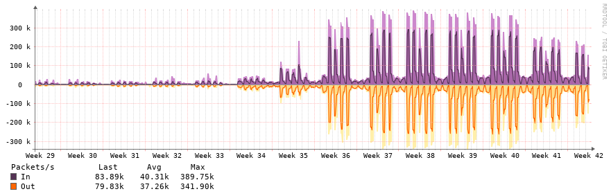 |
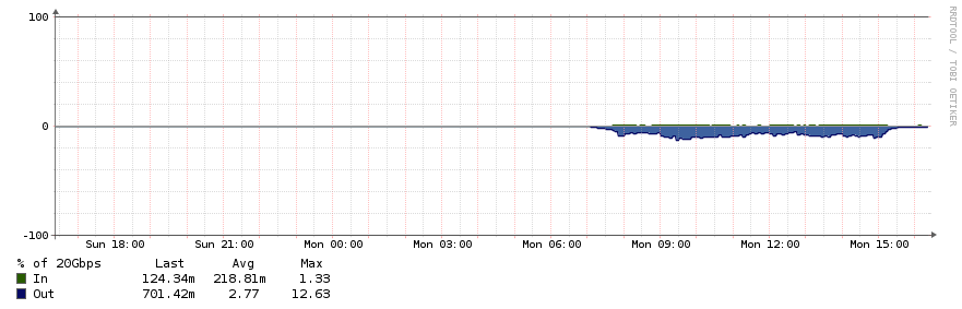
| Utilization | Percentage utilization of circuit. |
|
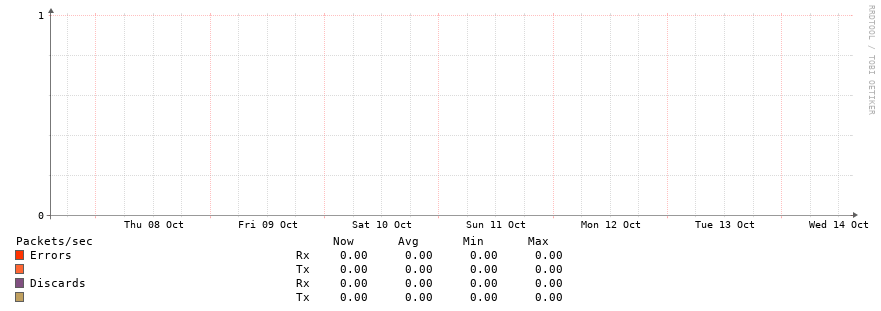
| Errors | Number of ethernet or CRC errors on the link. Ideally this should be zero and the graph should be pretty boring. If you see errors, contact support to troubleshoot. |
|
| Discards | Number of discards on an interface. Discards may occur if a link is saturated |
|
...
| Term | Description | Example Graph |
|---|---|---|
| Ping Response Time | Time in milliseconds it took our monitoring server to ping WiscNet router on premise. Ping is currently sourcing from Eau Claire, WI. |
|
| CPU | Processor utilization of device |
|
| Optical Monitoring (DOM) | Shows light levels received on fiber optic connections |
|
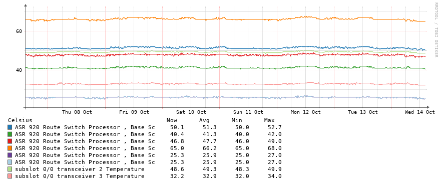
| Temperature | Internal temperature of device. Some models will have multiple sensors. Y axis changes dynamically. |
|
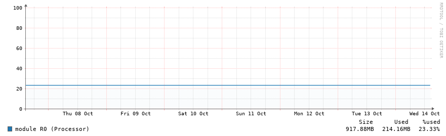
| Memory | Memory utilization of WiscNet router. Some devices may display multiple readings depending on memory pool |
|
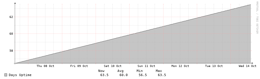
| Uptime | Length of time in days since WiscNet router has last rebooted. Always up and to the right. Read the legend to get the time in days. |
|
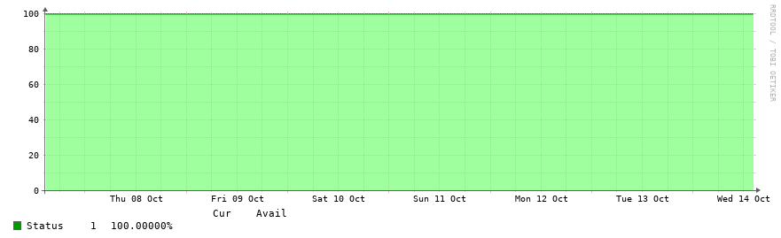
| Status | Status of device over time, calculated as percent. |
|
Changelog History
- - Added Network Diagram, Bandwidth Utilization Percent, Upload/Download colour coding
- - Added CPE network graphs
- - Fixes for Mobile view
- - Clarify CPE interface names with 'Port'
- - Initial release of graphs.wiscnet.net. Replaced nrg.wiscnet.net.